How to work with binary logs#
We will invent a binary log – maybe you can load it from an LAS file with welly.
import numpy as np
%matplotlib inline
import matplotlib.pyplot as plt
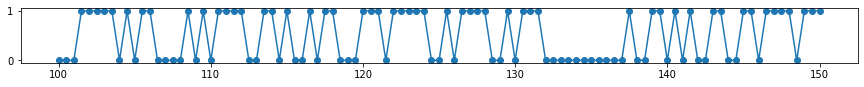
fake_depth = np.linspace(100, 150, 101)
fake_log = np.array([np.random.choice([0, 1]) for _ in fake_depth])
plt.figure(figsize=(15, 1))
plt.plot(fake_depth, fake_log, 'o-')
[<matplotlib.lines.Line2D at 0x7f9162986c80>]
Make a striplog#
A Striplog is a sequence of Interval objects (representing a layer). Each Interval must contain a Component (representing the layer, perhaps a rock).
from striplog import Striplog, Component
comps = [
    Component({'pay': True}),
    Component({'pay': False})
]
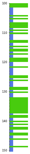
s = Striplog.from_log(fake_log, cutoff=0.5, components=comps, basis=fake_depth)
s[-1].base.middle = 150.5 # Adjust the bottom thickness... not sure if this is a bug.
Each Interval in the striplog looks like:
s[0]
| top | 100.0 | ||
| primary |
| ||
| summary | 1.50 m of True | ||
| description | |||
| data | |||
| base | 101.5 |
Plot the intervals#
To plot we need a legend, but we can generate a random one. This maps each Component to a colour (and a width and hatch, if you want).
We can generate a random legend:
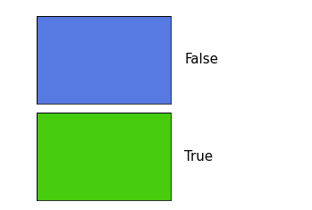
from striplog import Legend

legend = Legend.random(comps)
legend.get_decor(comps[-1]).width = 0.2
legend.plot()
Or we can make one with a bit more control:
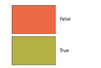
legend_csv = """colour,hatch,width,component pay
#48cc0e,None,1,True
#5779e2,None,0.2,False"""

legend = Legend.from_csv(text=legend_csv)

legend.plot()
s.plot(legend=legend, aspect=5)
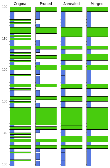
Remove thin things#
We can remove thin intervals:
pruned = s.prune(limit=1.0, keep_ends=True)
Now we can anneal the gaps:
annealed = pruned.anneal()
Then merge the adjacent intervals that are alike…
merged = annealed.merge_neighbours() # Anneal works on a copy
We could have chained these commands:
merged = s.prune(limit=1.0, keep_ends=True).anneal().merge_neighbours()
Let’s plot all these steps, just for illustration:
fig, axs = plt.subplots(ncols=4, figsize=(6, 10))

axs[0] = s.plot(legend=legend, ax=axs[0], lw=1, aspect=5)
axs[0].set_title('Original')
axs[1] = pruned.plot(legend=legend, ax=axs[1], lw=1, aspect=5)
axs[1].set_yticklabels([])
axs[1].set_title('Pruned')
axs[2] = annealed.plot(legend=legend, ax=axs[2], lw=1, aspect=5)
axs[2].set_yticklabels([])
axs[2].set_title('Annealed')
axs[3] = merged.plot(legend=legend, ax=axs[3], lw=1, aspect=5)
axs[3].set_yticklabels([])
axs[3].set_title('Merged')
plt.show()
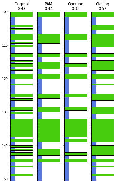
Dilate and erode#
This would be a binary thing, at least for now. I made an issue for this: https://github.com/agile-geoscience/striplog/issues/95
You need to be on striplog v 0.8.1 at least for this to work.
fig, axs = plt.subplots(ncols=4, figsize=(6, 10))

opening = s.binary_morphology('pay', 'opening', step=0.1, p=7)
closing = s.binary_morphology('pay', 'closing', step=0.1, p=7)

axs[0] = s.plot(legend=legend, ax=axs[0], lw=1, aspect=5)
ntg = s.net_to_gross('pay')
axs[0].set_title(f'Original\n{ntg:.2f}')
axs[1] = merged.plot(legend=legend, ax=axs[1], lw=1, aspect=5)
axs[1].set_yticklabels([])
ntg = merged.net_to_gross('pay')
axs[1].set_title(f'PAM\n{ntg:.2f}')  # Prune-anneal-merge
axs[2] = opening.plot(legend=legend, ax=axs[2], lw=1, aspect=5)
axs[2].set_yticklabels([])
ntg = opening.net_to_gross('pay')
axs[2].set_title(f'Opening\n{ntg:.2f}')
axs[3] = closing.plot(legend=legend, ax=axs[3], lw=1, aspect=5)
axs[3].set_yticklabels([])
ntg = closing.net_to_gross('pay')
axs[3].set_title(f'Closing\n{ntg:.2f}')
plt.show()
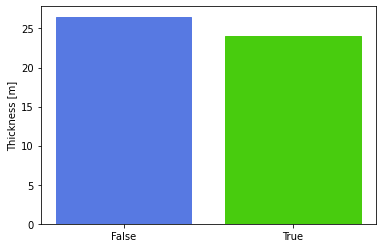
Some statistics#
We can get the unique components and their thicknesses:
s.unique
[(Component({'pay': False}), 26.5), (Component({'pay': True}), 24.0)]
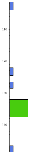
We can get at the thickest (and thinnest, with .thinnest()) intervals:
s.thickest()
| top | 132.0 | ||
| primary |
| ||
| summary | 5.50 m of True | ||
| description | |||
| data | |||
| base | 137.5 |
These functions optionally take an integer argument n specifying how many of the thickest or thinnest intervals you want to see. If n is greater than 1, a Striplog object is returned so you can see the positions of those items:
s.thickest(5).plot(legend=legend, lw=1, aspect=5)
Bar plots and histograms#
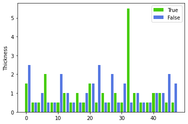
We can make a bar plot of the layers:
s.bar(legend=legend)
<AxesSubplot:ylabel='Thickness'>
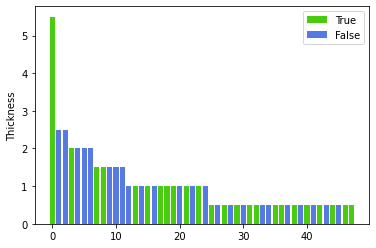
More interesting is to sort the thicknesses:
s.bar(legend=legend, sort=True)
<AxesSubplot:ylabel='Thickness'>
Finally, we can make a thickness histogram of the various types of component present in the log.
n, ents, ax = s.hist(legend=legend)
s
Striplog(48 Intervals, start=100.0, stop=150.5)
legend
| component | width | hatch | colour | ||
|---|---|---|---|---|---|
| 1.0 | None | #48cc0e | ||
| 0.2 | None | #5779e2 |
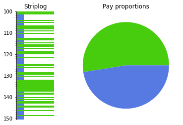
data = [c[1] for c in s.unique]
colors = [c['_colour'] for c in legend.table]

fig, axs = plt.subplots(ncols=2,
                        gridspec_kw={'width_ratios': [1, 3]})

axs[0] = s.plot(ax=axs[0], legend=legend)
axs[0].set_title("Striplog")

axs[1].pie(data, colors=colors)
axs[1].set_title("Pay proportions")

plt.show()